Introduction
This piece was originally written for a talkshow at ADGI Design Week 2025, in a session titled Designer’s Role in Political Futures. The programme explored how designers navigate the shifting landscape of power, imagination, and civic responsibility, and for our part included archive-based case studies that revealed how visual culture carries the traces of political life across eras. What follows is a reflection on how Indonesian graphics continue to speak to contemporary questions, and how movements like ours remind us that design has always been a language of memory, a tool for storytelling, and a form of resistance.
–––
As we’ve seen in our work collecting Indonesian archives in Grafis Nusantara, design shapes how something functions, how people use it, and who benefits from it. Every design object, including ephemera, influences behaviour. Because of this, design is never outside political life. Even the smallest design decision can reinforce an existing power structure or challenge it.
This connection between design and politics becomes clearer when we look at the long, layered story of ‘Grafis Nusantara’, the phrase I’ll be using to describe the vast visual landscape of Indonesia. This landscape has been shaped by centuries of interaction, from colonial occupation and the fight for independence to national development agendas and the creative shifts that emerged after reform.
‘Grafis Nusantara’ reflects an identity that has never been singular. Indonesian design grows out of points of encounter. It draws from imported ideas, inherited traditions, and innovations that emerge from local communities. It sits between many forces – between tradition and modernity, between central authority and public initiative, and between collective ideals and individual expression.
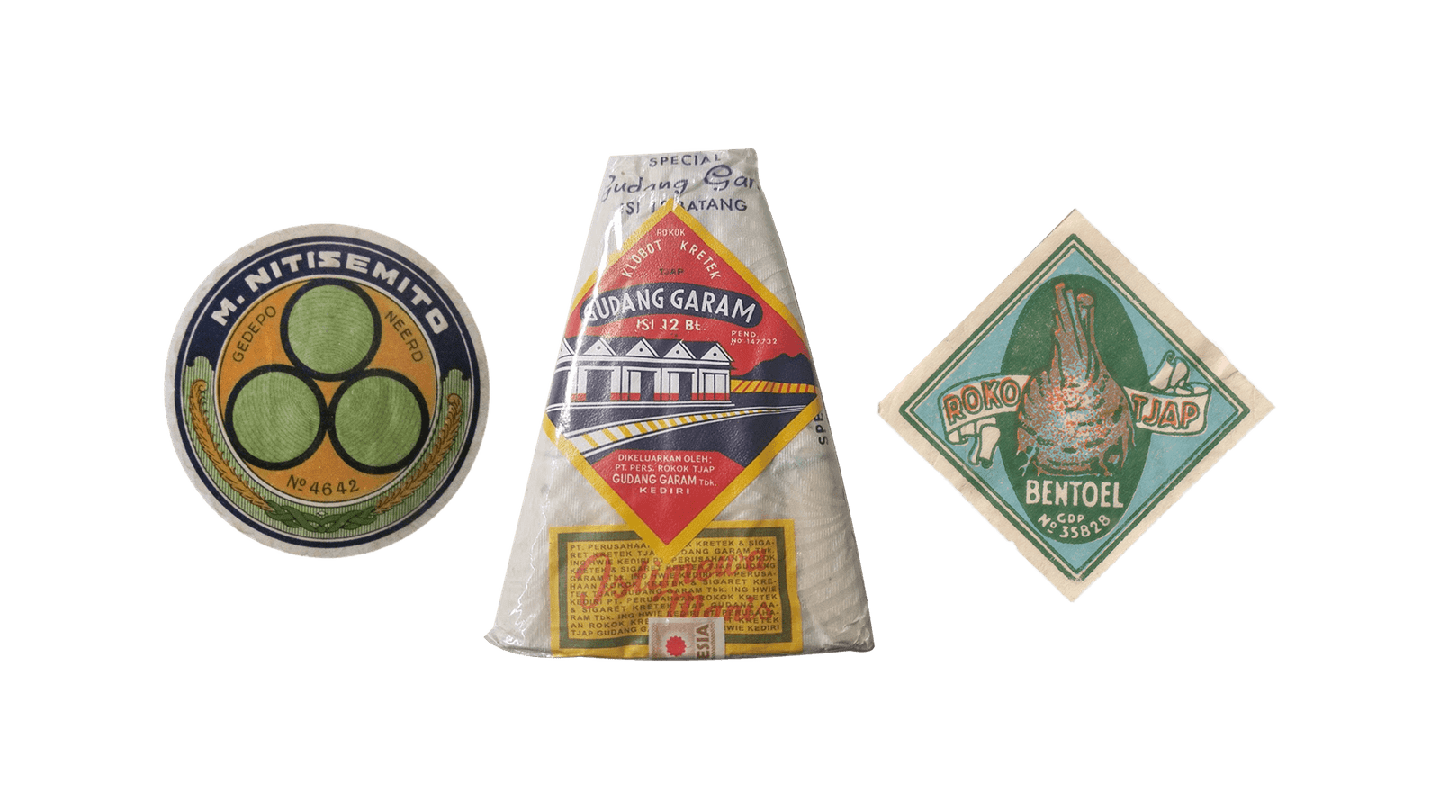
A series of Indonesian labels, where multiple scripts coexist on each one. Collection of Grafis Nusantara.
Let’s take a look at some case studies. These examples help us see how design operates within real social contexts as part of everyday negotiations of power, identity, and aspiration. By tracing specific artefacts, environments, or local practices, we can observe how communities adapt visual language to their needs, how designers respond to political shifts, and how certain motifs travel, transform, and take on new meanings. These case studies also reveal that what we often call “vernacular design” is not accidental or naïve but a living archive of choices, constraints, creativity, and cultural exchange. Through them, we can better understand how ‘Grafis Nusantara’ continues to grow from countless interactions that shape the Indonesian visual landscape.
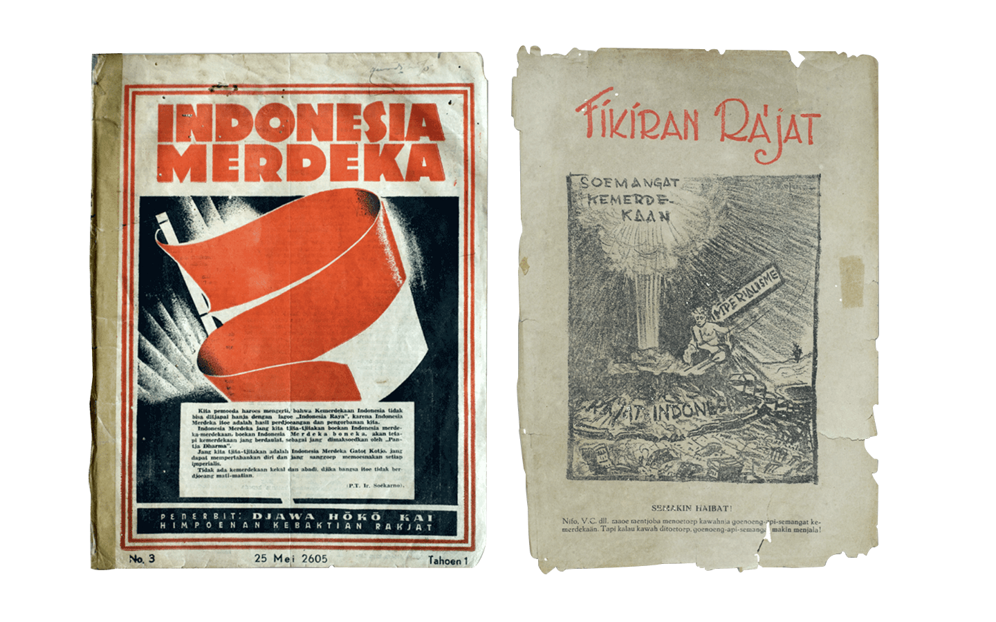
Printed voices of the early Indonesian revolution: Indonesia Merdeka and Fikiran Rajat, where typography, illustration, and language converge as tools of resistance.
1945-1949 – Indonesian National Revolution
During the Indonesian National Revolution between 1945 and 1949, visual communication became a crucial tool for mobilising public support and building a sense of shared national purpose. Designers, illustrators, and community printmakers adapted techniques found in American wartime posters, Soviet revolutionary graphics, and European anti-fascist visual culture. These influences were not copied directly but reworked to fit Indonesia’s political urgency and cultural reality.
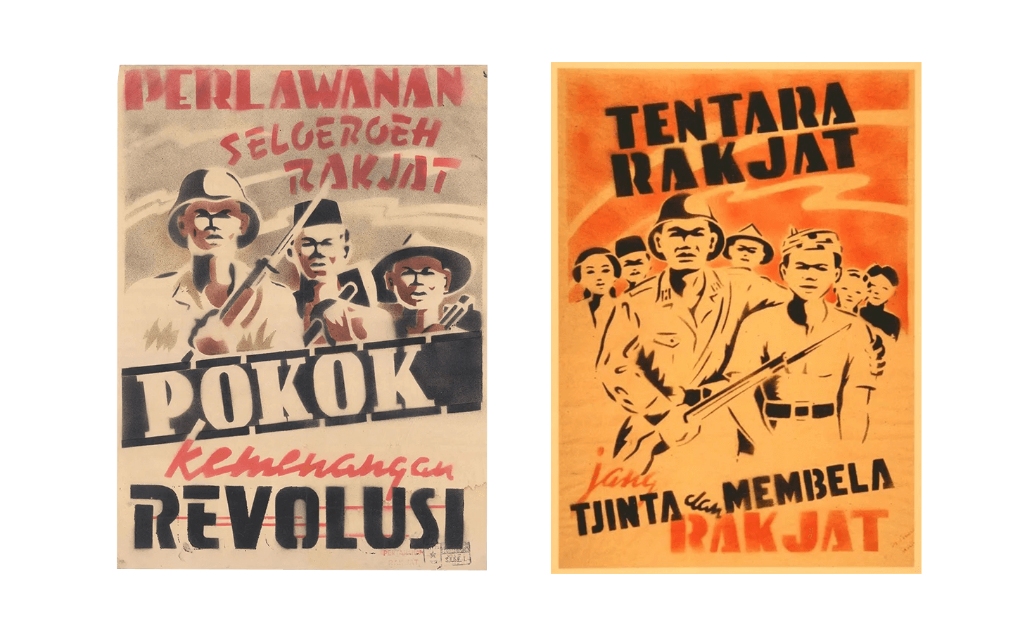
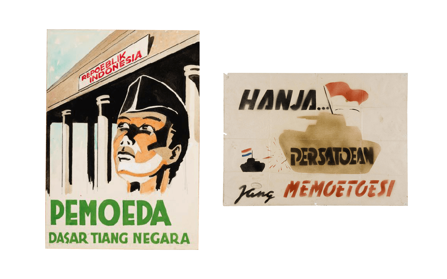
These posters were mostly produced by anonymous artists and revolutionary collectives during the Indonesian Revolution (c. 1945–1949). Created by pemuda groups, people’s militias, and local propaganda units, they prioritised speed and clarity over individual authorship.
These guerilla-styled posters were produced by PTPI, the Indonesian Painters Association, during the early years of the revolution. They show a distinctive blend of hand-painted realism and stencil-based graphics, resulting in visuals that feel urgent, raw, and close to the people. Many of them feature idealised figures such as young fighters, workers, and “pemuda,” all portrayed with determination and forward-moving energy. Their poses echo global propaganda styles of the era, but the imagery is grounded in local symbolism: red-and-white flags placed on the village backdrops, and slogans written in early republican orthography.
The posters were often made using simple tools and improvised materials, which made stencilling a practical and efficient choice. PTPI worked closely with community groups and youth organisations to produce these visuals, and archival accounts describe children and teenagers helping to stencil and paint posters in the streets, as captured in the photographs by Cas Oorthuys, a Dutch photographer who travelled to Indonesia during the era.
This involvement turned poster-making into a collective act of struggle. It was not only the content of the posters that carried political meaning, but also the way they were produced: built by ordinary people, distributed through local networks, and displayed across urban walls and wooden boards in strategic public spaces. These images helped maintain morale, signal resistance, and teach people about the stakes of independence. They now stand as a visual record of how art, community energy, and political defiance came together during a formative moment in Indonesia’s history.
1950s – Building the New Nation
In Indonesia’s early years as a new nation, design supported a project of unity. Under Sukarno’s leadership, posters and emblems played a direct ideological role. They helped people imagine what the nation could become. The creation of Garuda Pancasila illustrates this clearly. The emblem went through multiple stages of negotiation, revision, and cultural synthesis. The government first commissioned a design team led by Sultan Hamid II of Pontianak, with Sukarno closely overseeing the process. Early sketches resembled a more Western style of heraldic eagle, complete with sharp lines and a more naturalistic form. Sukarno rejected these drafts, insisting that the symbol must feel rooted in Indonesian traditions and not look like it belonged to a European monarchy.
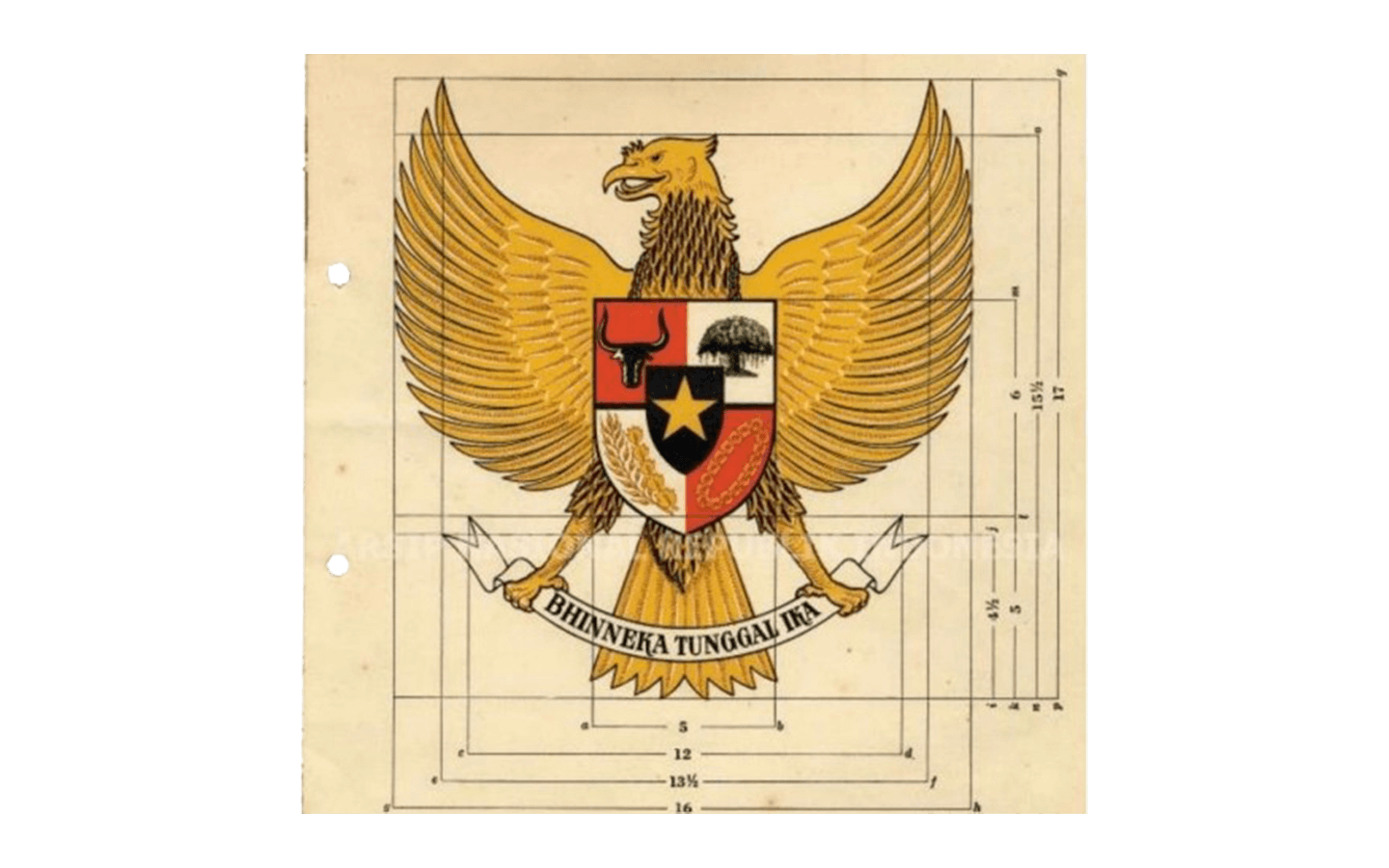
A diagram from the National Archives of Indonesia showing Garuda Pancasila, the national emblem officially adopted in 1950 and designed by Sultan Hamid II under Sukarno’s supervision. Its heraldic form encodes the five principles of Pancasila and symbols of independence and unity (Bhinneka Tunggal Ika).
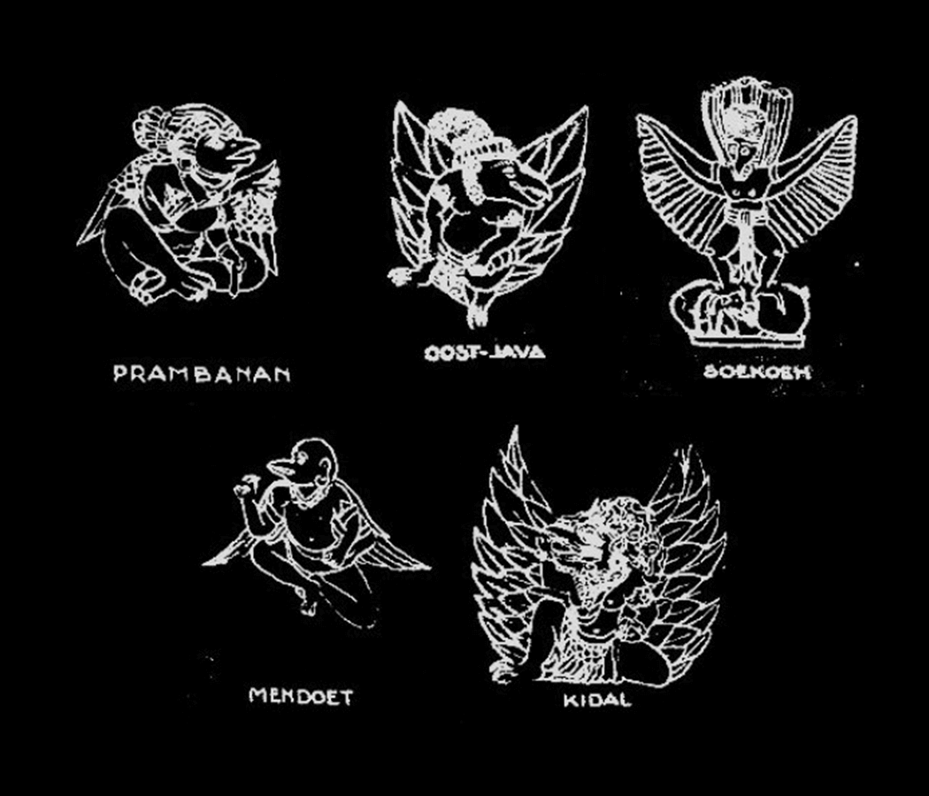
These sketches show regional interpretations of the Garuda motif, drawn from temple reliefs and local visual traditions such as Prambanan, Mendut, Kidal, and regions like East Java. Before Garuda Pancasila was standardised in 1950, the Garuda circulated in many forms, shaped by archaeology, mythology, and colonial-era documentation of heritage sites.
Through several rounds of refinement, designers began transforming the bird into a creature that could hold multiple cultural references at once. They kept the broad structure of Western heraldry because it communicated authority and statehood, but they altered its posture, feathers, and silhouette to resemble the Garuda found in Hindu-Buddhist art. They added Javanese aesthetic cues, such as the upright stance, stylised wings, and the shield placed at the centre of the chest. The five symbols inside the shield were then chosen to represent the Pancasila principles, turning the emblem into a visual manifesto of national ideology. Even the number of feathers on the wings, tail, and neck was adjusted to correspond with symbolic dates in the nation’s history.
This process shaped the identity of Indonesia and helped define what the state wanted to represent: a modern republic with deep historical roots, diverse yet unified, local yet globally legible. At that moment, design served a utopian aspiration. There was a belief that the right visual symbols could help build the right collective future, and the Garuda became the most enduring expression of that hope.
If you’re interested to read more into the story, I’d recommend the book Garuda Pancasila: Sejarah Penciptaan Lambang Negara and browse through Arsip Nasional digital repository. I would regard Garuda Pancasila as one of the earliest “design briefs” that was documented well. The digital publication Badan Pembinaan Ideologi Pancasila (BPIP) — Garuda Pancasila: Sejarah Penciptaan Lambang Negara (2023) — is a modern, well-researched and comprehensive account on the design process, historical roots, and symbolic meanings behind Garuda Pancasila.
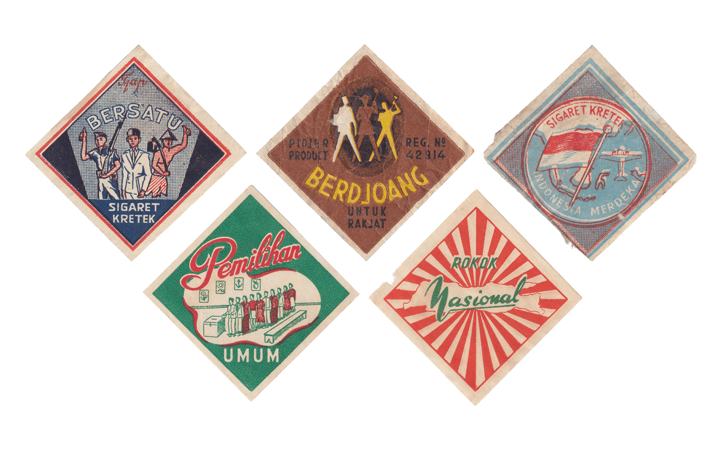
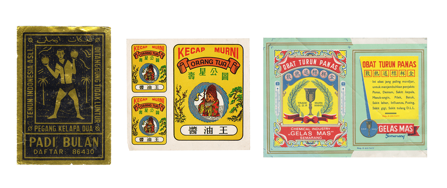
Mid-century Indonesian cigarette labels, where everyday commodities carried political language. Through slogans like Bersatu, Indonesia Merdeka, and Pemilihan Umum, commercial graphics became a site where nationalism, labour, and popular imagery converged in daily life. Collection of Grafis Nusantara.
What follows shows how the imagination of Indonesia’s founding generation took root in everyday life. Ordinary consumer products echoed the same optimism and collective hope for the nation, almost like a shared prayer rendered through image and colour. Many cigarette labels carried uplifting slogans — “Rokok Nasional”, “Bersatu”, “Berdjoang”, and “Indonesia Merdeka” among them — now preserved within the Grafis Nusantara collection. One label stands out: “Pemilihan Umum”, referencing Indonesia’s very first national election in 1955, a historic moment long remembered by Indonesians as the “Pesta Rakyat”, the people’s celebration.
1965-1998 – The New Order
Politics changed when Indonesia entered the New Order. Design no longer aimed to inspire unity through imagination. It aimed to maintain order and control. The Suharto regime demanded neat, clean, rational visuals that reflected the rhetoric of stability and economic growth. Government design manuals dictated the smallest details, including logo curves and emblem placement. Designers became part of the bureaucratic structure and were expected to support the image of a disciplined, modern nation. Good design at that time meant design that obeyed rules and aligned with state goals.

Late New Order–era visuals showing a shift from revolutionary collectivism to cultural spectacle and consumer identity. All of these posters were commissioned by the state as instruments of public control, shaping behaviour and sentiment through design. On one side, Buatan Indonesia. Mengapa Tidak? frames nationalism through consumption and branding; on the other, a glittering concert poster turns tradition into pop performance.
There are already many well-known examples of state-driven design from the New Order, although some of them remain sensitive to discuss due to how deeply and coercively they were woven into everyday life. Instead of revisiting those overt cases, we highlight a few subtler examples — visuals that may appear ordinary at first glance, yet skillfully reveal how state narratives were gradually infused into the imagery Indonesians encountered daily.
The “Cinta Indonesia” poster from 1984 illustrates the way the Indonesian government used visual communication to promote cultural pride and reinforce ideas of national identity. Designed for a government-supported performance led by Guruh Soekarnoputra, the poster merges theatrical flair with recognisable Indonesian cultural symbols. Through its stylised figures, bold lighting, and ornate visual elements, it presents Indonesia as modern while still anchored in tradition.
Meanwhile, the “Buatan Indonesia. Mengapa Tidak?”, visual designed by Hanny Kardinata comes from a national design competition organised by UP3DN, the governmental agency responsible for promoting domestically manufactured products. The design depicts a hand holding a bright red shopping bag printed with “Buatan Indonesia,” turning everyday consumer behaviour into an act of patriotism. The message was direct and strategic — encouraging Indonesians to choose locally made goods as part of a national economic push.
Even within such a controlled environment, resistance appeared. Designers borrowed official visual elements and twisted their meanings. They turned state symbols into tools for critique. Design became a voice for communities rather than a tool of authority.
A vivid example can be seen in the explosion of urban pop-culture stickers that spread across Indonesian cities in the late 1990s and early 2000s. As explored in Grafis Nusantara Volume 4, this wave of sticker-making emerged during a period when public space was becoming more open after years of tight regulation. Major producers like AMP Malang, along with independent artists and small collectives, created stickers that blended humour, satire, regional slang, and subcultural references. Because they were small, stickers circulated easily; because they were informal, they often slipped past regulation. They moved from motorbikes to angkot windows, from market kiosks to school backpacks, forming an organic, decentralised network of visual communication.
Sticker culture shows what happens when ordinary people use design to take back public space. It reminds us that political expression does not always appear through dramatic acts; it can emerge through something as simple as a vinyl sticker on a street pole. These small graphics captured the public mood of the moment, offering a counterpoint to the sleek imagery of corporate ads and the instructive visuals of state campaigns. Above all, they proved that design is not exclusive. Communities created their own visual language with whatever materials they had, shaping narratives that felt immediate, local, and their own.
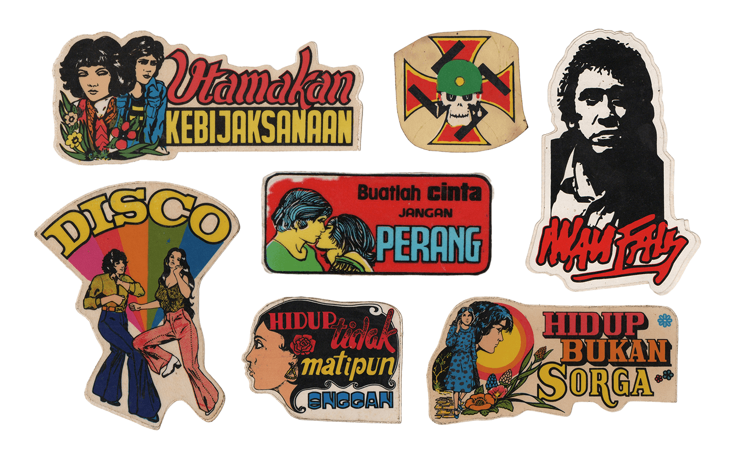
Pop-culture stickers circulating in Indonesian cities. Small, informal, and easy to spread, they appeared on everyday surfaces and became a grassroots form of visual expression, reflecting local humour, shared references, and the changing use of public space. Collection of Grafis Nusantara.
Through these small, everyday acts of creativity, we can see how Indonesians continually negotiate identity, authority, and personal expression. Urban sticker culture represents just one thread within a much larger visual landscape, yet it captures the spirit of ‘Grafis Nusantara’. It points to a cultural environment shaped not by directives from above, but by the choices, voices, and agency of the people who produce and circulate these images.
The relationship between design and politics has long been shaped by friction. Governments aim to channel design toward uniformity and control, while ordinary people push back by creating their own visual languages. Sometimes these opposing forces collide; sometimes they sit side by side in the same streets and surfaces, each trying to shape how the environment is read. In a larger sense, the trajectory of Indonesian design parallels the country’s own path — moving through questions of unity versus diversity, through tensions between control and freedom, and through the continual balancing of local identity with global currents.
Today?
Today, many people assume that design has become more open than in the past. Accessible digital tools and vast online platforms allow more individuals to take part in visual production. Yet this sense of openness arrives with its own political pressures. Designers now work under the demands of the market. Algorithms influence what becomes popular. Metrics determine which ideas survive. Aesthetics are often shaped by the pursuit of engagement and visibility. In this environment, many designers end up working within systems that value data and consumption more than reflection and meaning. Visual order no longer comes from the state. It emerges from market logic whose patterns feel diffuse and invisible.
Amid this shifting visual landscape, ‘Grafis Nusantara’ asserts that design in Indonesia has never been singular, fixed, or apolitical. It has always carried the weight of diversity, negotiation, and cultural agency. It challenges the desire for clean categories or tidy definitions, urging designers to embrace the complexity that truly defines the archipelago.
Indonesian designers are not merely makers of appealing images. They are interpreters of meaning in a society layered with languages, symbols, and collective memory. A poster that draws on a regional saying, a typeface that revives an endangered script, or a layout shaped by communal aesthetics does more than communicate — it becomes an act of cultural assertion. Through these gestures, design gives communities a way to see themselves in the public realm and safeguards stories that might otherwise fade.
Every design decision shapes power. Designers determine who is visible and who remains overlooked, whose stories enter the frame and whose are left in the margins. These choices influence how communities imagine themselves and how they understand their place within the broader nation
Reclaiming Ownership
In a world where images circulate faster than their makers can name them, authorship becomes fragile. Visuals may slip out of their origins, detach from their contexts, and often return as commercial assets owned by someone else. In such a landscape, reclaiming ownership becomes more than a professional stance. It becomes a political act. Choosing one’s own narrative, pace, and visual language is a refusal to be swept into systems that extract creativity without acknowledging its roots. It is a declaration that design is not merely content but a form of knowledge, interpretation, and authorship.
Reclaiming control does not require designers to abandon technology or reject collaboration. Instead, it calls for a deeper level of awareness. It asks designers to recognise how algorithms shape attention, how platforms dictate behaviour, and how trends are produced, circulated, and normalised. It urges them to question who benefits from their labour, whose stories their visuals amplify, and which systems their work reinforces or disrupts. Designers who cultivate this awareness shift their position. They no longer stand behind authority as decorators. They begin to stand beside it, shaping, negotiating, and sometimes challenging the directions it takes.
Across Indonesia, this awareness is growing. Small movements form in design studios, community print labs, and collectives. These spaces reject the idea that design must always follow client briefs or market demands. Instead, they create work with intention and curiosity. They experiment with typography rooted in local scripts, preserve visual histories through grassroots archiving, reinterpret traditional motifs through contemporary lenses, and explore ways of designing with communities rather than only for them. Their work asks how design can serve society with humility and care, rather than speed and spectacle.
‘Grafis Nusantara’ thrives within this atmosphere. It is a way of thinking, a practice of being attentive to the layers and plurality of Indonesian visual culture. It accepts the past, embraces the present, and remains open to influences that arrive from elsewhere. It is critical without being cynical, grounded without being rigid, and hopeful without being naive.
Because design has never been neutral. Every letter, colour, and image shapes how people see themselves and each other. Once we recognise this, we can design with greater intention and ethical clarity. Speaking of design and politics should not be limited to election materials or propaganda posters. Politics also lives in choices: let’s say in how we frame a photograph, how we compose a layout, how we label a community, how we honour or overlook a story.
Design can maintain power or redistribute it. It can impose uniformity or celebrate difference. It can close doors or open them. Its quiet force lies in its ability to surface what has been ignored, to give form to what has been unspoken, and to reveal the textures of everyday life.
In the end, ‘Grafis Nusantara’ tells a story about how a society chooses to see itself. It reminds us that each line, shape, and composition participates in an ongoing conversation about identity, memory, and aspiration. It asks, persistently, who we are and who we are willing to become.